Thursday, 10 May 2012

Evaluaton Question 3


In the beginning we created an animatc to represent what we wanted to do for our music video. We matched our drawings up with the song and presented it to our class for feedback. The positive feedback was that they thought we had used a good range of shot types and angles. Negative criticisms we received were that the story line was not made very clear by the narrative and we were asked to explain the basics of the story. We also got criticised for not having much movement in our shots and they all appeared quite stationery and those shots didn't suit the music video. After this we went back to our animatic and put in more movement for the shots that needed it and timed the shots better to the beat of the music.

After this we created a rough cut for our music video using some shots that we had already filmed. Based on the feedback we got when presenting our rough cuts to the class we got lots of positive feedback on how we played around with the colour of each shot. We decided to use this to our advantage and use the three way colour wheel to make certain shots with one character a bit more warm with sepia tones and make some shots for the character a lot more colder with more blue tones to it. Advancing the theme of the divide between the two characters.
We also got very positive feedback on playing around candles and different types of lighting so when we filmed more we put into practise the idea we had of filming lots of candles being blown out and then using premier pro to put these shots in reverse and changing the speed. The audience responded to this positively as it was unexpected and quite unusual. Me and my partner also discovered an app on the iphone which created a flashing strobe light effect with a light on the back of the phone. We filmed the strobe light against a plain wall with the shadow of hand that made it look like someone was running. We got good feedback on this shot and the reverse candle shot was what was mentioned a lot but it is questionable if the strobe effect necessarily fit the theme of the video.
Some negative feedback we got on our rough cuts is that our shots were static and still and there wasn't very much action. We tried to fix this by adding a fight scene at the end of the music video. We also turned the shots upside down and backwards to the beat to create more movements in whilst using the same shots.
Our shots on our rough cut didn't go with the beat so whilst we edited further on our music video we counted along to the sound of the beat and cut most shots on the 4th beat but towards the end we disrupted the order and cut the shots to the off beats so that the music video didn't feel too repetitive which we got criticised for earlier on when we presented our rough cuts.

Once we finished the music video and all the details were finalised we presented it to our class for the final time to receive feedback. The positive comments mainly focused on our variety of shot types and editing including cutting the shots to the beat and the use of the reverse effect on the candles. We also got positive feedback on how we had developed the colour scheme for our two main characters and that they liked how we had changed the colours using the three way colour wheel and that it made more unusual fitting our synth-pop/electro genre. The main comments on the negative feedback were that the narrative was still a bit unclear but felt that it suited the song more than having an obvious story line. Overall there was a good response to our music video from our audience, even getting such comments as 'It was scary" which means we got a reaction to our music video which is what we wanted.

We then had to create a magazine advert and a digi pak cover for our music. We presented drafts of each and overall got mainly positive feedback. We used the same masks that we had used for the music video in the magazine advert and cover of the digi pak and it was commented that this was a good idea as it created a clear link between the music video and its advertising. We got negative feedback on our choice of fonts and where we placed them as you couldn't see them very clearly so when it came to making the poster and digi pak we played about with the fonts and there placements to see which one was the clearest and suited the genre the best.

Tuesday, 7 February 2012

Evaluation Question 4

Youtube
We used Youtube to look at similar music videos of our Genre so we could look at the conventions that we could interpret or challenge. We also used Youtube to look at tutorial for premier pro and Photoshop techniques to help or work look more professional and so we could learn new skills.

Google
We used Google to search for sites to help us to look into our genre and we used to to find sites to help us with skills and techniques on Photoshop and Premier Pro.

Blogger
I used Blogger to post my research, feed back and development of my work.

Facebook
I used Facebook to post my survey in order to research my target audience and find out what they liked and disliked in music videos. It was used to help develop our product as we were able to ask our target audience directly what they would expect of a music video and get a large response back.

Camera
We used the sony camera to film he the shots for our music video then we then later editor on premier pro. We also used it to take pictures of our adverts and digi-paks and post them on on our blogs to show research and development and to gain feedback.

Premier pro
We used Premier Pro to do all the editing of our music video, enabling us to use different transitions, to crop, to play around and change the colour and cut clips to the beat making our music video seem professional.

Photoshop
We used Photoshop to make our Digi-paks and adverts. this allowed us to manipulate images by cropping, editing the colour and using different filters and adding text to make it seem realistic and professional.

Amazon
We used Amazon to research diferent album covers in the genre of electro/synth/pop to help us with the creation of our own digipaks. This allowed us to look at typical conventions and to decide whether to use them or challenge them.

Wikipedia
We used Wikipedia to look at our artist and to gain more information our genre so we could have a better understanding of the conventions and history when making the products.

Evaluation Question 2

Monday, 23 January 2012

Music Video Evaluation - Question 1

Frame 1 - Gramophone
In this shot we tried to challenge the conventions of music videos in our genre which is indie/electro/synth pop. We developed our idea from other music videos that usually start of with focusing in on a instrument (usually a keyboard or piano) and someone starting to play it and that is when you hear the music start. However instead of starting of with an instrument, we wanted to give our music video a vintage feel so we decided to demonstrate the music starting in the music video with the needle being put down on a gramophone.

Frame 2 - Reverse effect
In this shot we got one of the main characters to throw flour up into the air with a light shining on it and it dispersed out slowly into the air giving a ghostly cloudy effect. During editing we decided to reverse this shot so we see the ghostly cloud come back together and gave it an artsy feel. When looking at other music videos in this genre we didn't really see a reverse effect used so overall I think we challenged what would usually be done in inde/electro/synth pop videos.

Frame 3 - Candles
We used the reverse effect again on a shot were we lit lots of tea candles and then blew them all out using a fan. We used the reverse effect to look like the candles light up by them selves to go with the title of our song choice 'Illuminated'.

Frame 4 - Woodland
Another convention we used is having a outside setting. We noticed that when looking at music videos in our genre that they sometimes have a outside, suburban looking setting or are sometimes set in a forest or woodland type area. We decided to have one of our main characters walking through a forest to show that she is trying to go somewhere and is looking for something. We challenged this convention however, by having no camera movement as usually shots like this more with the character as they walk so it feels k=like you are walking with them. We wanted our audience to feel separated from our characters.


Frame 5 - Artist
I think that this shot is the shot that uses the most obvious convention of indie/electro/synth-pop which is showcasing the artist miming along to the song on there own with a plain/dark background and not much else is going on. We developed this convention by having the shots if the artist in black and white and only the shots containing the artist are in black and white to separate him out from the rest of the video were we tried to make the colour of the video dull and almost vintage looking. We did this to isolate him, therefore making him the central focus of the music video.

Frame 6 - Fight scene
The fight scene is the pivotal moment in our music video when the storyline comes together and we see the two opposites attract and then. literally collide with each other. This went against the conventions of music videos in this genre because they usually tend to be quite vague and not have a obvious storyline. I think our storyline does use the conventions and remains quite vague and ambiguous for three quarters of the video but then it becomes more noticeable when see the two different characters fight.

Frame 7 - Lighting effects
We used a convention by playing around with the lighting and eventually came to using the strobe lighting to give our  music video a scary/eery feel. Even though it was just the shadow of a hand in front of a strobe light it was simple but effective.

Frame 8 - Instrument (Keyboard)
We used one of the most obvious conventions of a music video which is showing the main instrument in the video from that genre and for us that was a keyboard. We filmed it from a higher angle which was slightly developing the conventions.

Frame  9 - Masks
The masks are representative for our storyline but are also part of the costumes and props. Our costumes conformed with other costumes in our genre as when we were researching we saw costumes used predominantly as something the audience should focus on. However we developed it by creating and designing the masks ourselves so they would be unique to our video as they were handmade, and this isn't something you usually see in synth/electro/pop music videos.

Monday, 9 January 2012

Magazine Advert


When creating the first draft for our magazine advert we looked at the conventions of adverts of a similar genre of our artist which is indie and synth-pop/electro. We chose to have the masks as the main image for our advert because that was the main focus of our video so we showed a strong link between the two. Also the conventions of magazine adverts in our genre don't usually show the artist on the front so we followed the conventions by not having the artist on the front. We also chose to have the masks on the magazine advert because it was a similar image to the one we used as the cover of our digi-paks and the covers and magazine adverts are usually the same or a similar image so that when people go to buy it it they know what to look for and can recognise it easily.

We decided to have the black and white cloth making a divide between the masks to represent the difference between good and evil which we portrayed in our music video. We also did it so it had a ying and yang style look to it it to symbolise the idea of balance and how the bad and the good can tie together.
We chose to have the artists name "HURTS" going across the middle and over the masks because we wanted it to be the central and hopefully most memorable thing that people see. We also wanted "HURTS" to be translucent so it didn't take away completely from the cover art and imagery and you can still see all of it. The reason we chose the title to be like this is because when looking at adverts of successful artists in this genre they used the artist name as the main feature and some time the only feature and it is usually quite large and the central focus.

The single title "ILLUMINATED" is significantly smaller than the artist title but is placed in an empty space at the bottom and is put in bold lettering so that your eyes are still drawn to it even though it is not a main feature and below that it leads on to the release date which follows the conventions of the release date being at the bottom of an advert so it is the last thing people see.

Thursday, 24 November 2011

Digipak feedback


We presented our draft of our digipak design today to our media class so we could get feedback on what was good about it and constructive feedback on the elements we could improve.

Pros -
·         They really liked the front cover of our digipak, they liked how we used the two masks that we used whilst filming and had the black and white divide as the background. They thought it fit the theme we had for our music video well.
·         They also liked that we used the image of the candles going across the whole inside of the front cover.
·         Another positive was the colour we used throughout was quite dark and in some points quite monotone. They thought that it was good as it fit the theme of our music video.
·         They thought using the close up of the eye made it quite mysterious.
·         They also thought the image on the back cover was appropriate for the song and we had framed it well.
Cons -
·         It was commented on that our pictures were quite straight forward and it was suggested that we could play around with some of the photos and manipulate them. For example, manipulating the image of the eye to make it look like there is something inside it.
·         It was also suggested that that we play around with the font and colour of the word 'ILLUMINATED' on our inside cover.
·         We were also given different ideas of how to make the title 'HURTS' look on our front cover. It was suggested that we could outline it in black and have the inside transparent or smudge the edges to show the disturbance.

Monday, 21 November 2011

CD covers in our Genre

Our song Illuminated by Hurts falls into the genre of Synthpop.
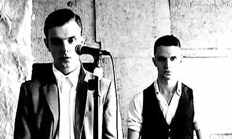
The Hurts album covers usually are very monotone or black and white and usualy fetaure themselves as the artists on the cover. the Band name is usually always the focus and the album or single title is usually significantly smalelr but still noticeable to the audience.
The Killers also fall into the category of synthpop and their alums and unlike Hurts rarely feature themselves on the covers. Usual the band logo and name of the album is the center focus of the album cover. They also use black and white on there covers but also have quite a few in colour but they have a vintage, monotone tone to them. The look of their covers has an indie feel to them. 
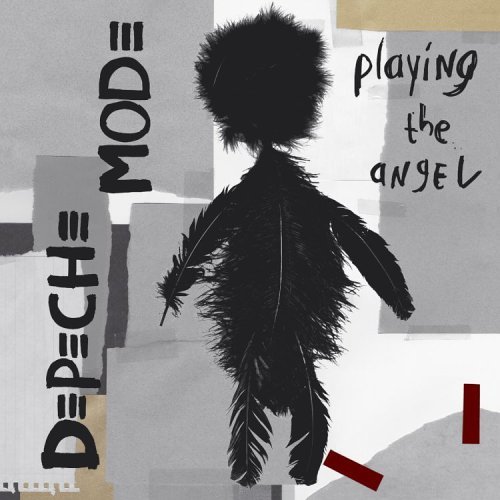
Depeche mode are another band that fall into the category of synthpop and share some of the similar fatures with the previous two album covers. The mover is mostly greay and black without much colour and like The Killers rarely feature the actual band on the cover.


Planning for our digipak

Definition of a digipak
Digipaks are a patented style of DVD and CD packaging made out of heavy card or cardboard material. They can be divided up into portions of 3 or fold out in the style of a book and have one or more plastic trays inside for the CD's. This plastic trays are simply attatched to the card background.
Digipaks don't crack like the standard jewel cases.

What is the purpose of a digipak?
This style of packaging is usually used for special editions or a premium packaging for CD's of DVD's. They are also used as there is more space.


Brainstorm- What should our digipak include?
  • Images - Masks, Forests, Feathers, Lights, Hands, Eyes, Cats eyes, Nature.
  • Colours - Black and White, Dark, Blue tones, Sepia, Vintage colours.
  • Text - Illuminated, Artist name. On the front cover.

Tuesday, 15 November 2011

What we filmed during the half term.

We were unfortunately left with a very limited amount of time to film what we wanted during the half term as I had to leave London for a week and my Partner had a university open day to go to so we only had 2 days to film.
As we had the whole day we decided to film at different points of the day to get different lighting and we also got the opportunity to film in the dark which gave us much more opportunity to play with light which is the main theme of our music video.

The main problem we face with having to film outside and deciding to have costumes was that the weather was much too cold so we couldn't stay filming one shot for too long, meaning the standard of the shots we got weren't as good as we would like them to be.

Thursday, 10 November 2011

Feedback on rough cuts of our music video - Illuminated.

We showed a rough version of our music video to our media class to get some positive and constructive feedback on it so we could improve it.

Positive Feedback
  • The positive feedback we received was that they liked how we had change the colour of some of the shots to gave the video a different feel and so the colour was not the same all the way through each shot.
  • Our group really liked and enjoyed our shots where we played around with the candles and the lighting.
  • We got positive feedback on our use of masks, saying it gave the video a unique feel and and good use of symbolism.
We also got some constructive feedback on what we could improve.
  • It was commented that we needed some more action in our shots so not all our shots were static and still.
  • We were also told to change the pace of our music video so that our shots would change at the right time with the beat and so they just didn't seem like continuous shots stacked on top of each other.
  • Also some of our shots are a bit long or a bit shaky so we should shorten some of our shots.
  • It was also suggested that we should have some sort of sound for the beginning of the intro rather than just silence. However, it was also said that they preferred the silence and thought it was a good opening. So we can play around with those two ideas and see which opening we think would be more successful.

Monday, 3 October 2011

Feedback on animatic.


Above you can find the animatic that me and my partner Tania made for our music video, Illuminated by Hurts. We presented this to the class and got feedback from them.

The overall feedback was that they thought we used a variety of camera shots and angels and they liked our main ideas. We were asked to explain the concept and the story line of our video to make it a bit more clearer and clarify it as some of our shots were quite ambiguous.
We have a shot of a dandelion being blown away and it was asked what could we use when we were filming if dandelions aren't in season by the time we film. We overcame this idea by coming up with the idea of using lots of lit candles, then blowing them out and reversing this so it would give the same effect of a dandelion being blown out. 
Some of the feedback that we got was that some of our shots were too long so we went back and drew the movement that was going to be in them to show them why they would be that long. Also it was commented on that some of our shots were unclear so we went back and added detail and writing to show what the shot was and make it more clearer.

Monday, 26 September 2011

Survey

To find out what our audience would expect and like from a music video we created a survey for them to fill it out. We posted it on our social networking sites and blogs to try and get as many people to do it so we had a wide and reliable range of answers.

Overall 63 people answered my and these results show that people mostly prefer a mixture of moods, not just happy and not just dark but both. Majority of people would prefer to see the artist in the music video than not. Our audience prefer music videos that don't have dancing in them and most preferred there to be a story line to the music video.Also the Majority preffered the music videos they watched to have a hidden meaning to it and like both costumes and casual clothing. The one result that almost got equally chosen was what setting they would like, which was between natural an urban. Meanin we can make the final choice on what setting we have in our music video as the audience choces are mixed. Most people also din't mind if the actors were a similar age to them or not and they wouldn't mind watching a music video that is longer than 5 minutes.

Wednesday, 21 September 2011

Katy Perry - Firework


Did Katy Perry's firework deserve to win the music video of the year award?


I personally don't think the video for Katy Perry's firework deserved to win the video of the year award. Simply because it is mostly unoriginal and plays on the strong 'feel good' clichés which is an idea used in most pop videos today. Not only are the ideas very unoriginal but they are shown with very uninteresting camera angles, movements and not much change in lighting. At points the special effects for the fireworks coming out of the characters and Katys chest become a bit over done and repetitive, making it very boring for us to watch. Makeup and costume in the video appear to be fairly average at most and you get the feel that not much thought went into the general look and theme of the music video over all. The video also relies heavily on close up shots of Katy, this cheapens the what is left of the sentimental feeling of the video when you realise how much Katy is used as a brand for the way she looks rather than her talent. The video is a bullet proof sentimental pop song that doesn't push any boundaries like it could of done and this is why I think it didn't deserve to win the video of the year award.

Tuesday, 20 September 2011

Our Target Audience


  • What music they listen to? Alternative, indie, rock, synth pop, electronic.
  • What they do at the weekends? They go shopping around Central London and look for small shops and chartiy shops to look through. They also go out to take photos and meet up with friends and have a coffee. When they aren't going out they stay at home and read, or play video games and paint.
  • What breakfast cereal they would choose? Corn flakes.
  • What mode of transport? They are most likely to use bus and tube.
  • Where/how they live? They live in suburban greater London in a quiet cul de sac.
  • Their favourite drink? Cherry coke and Water.
  • Their favourite TV shows? Dexter, Eastenders, Planet Dinosaur, Family Guy.
  • Their favourite vegetable? Broccolli, sweet corn and peas.
  • What sport they watch/play? Badminton and table tennis.
  • Who would be their ideal partner? Someone with a creative, down to earth personality who shares similar interest in music, books and art.
  • Where they go on holiday? Venice or Paris.
  • What restaurants they go to? Pizza Express and small casual diners.
  • What politcal party they would vote for? They don't care much about politics.

Copyright Letter

Thursday, 15 September 2011

Music Video Survey

This is my music video survey to see what my target audience will expect from my music video. It consists of ten questions and will take less than 5 minutes to do.
http://www.surveymonkey.com/s/MBPYNNQ

Tuesday, 13 September 2011

Music videos that I think are influential.

Coldplay - The Scientist
In this video we see Chris Martin (the frontman of Coldplay) go backwards in time through different English suburban streets, at the end revealing that he and his friend had been in a car crash. The reason I think this music video is influential is because of the unique concept, even though the whole video is in reverse the words are still lip synced with the song. Having the whole video going in reverse fits the lyrics "Lets go back to the start" perfectly, showing how he wished he could rewind everything and stop something bad from happening. 

Michael Jackson - Thriller
 
I think this is a influential music video because no one had quite done a music video that was very theatrical a more like a movie than a music video at that time. I also think it was very influential because of the costumes, each costume was different and looked very realistic making it scary for the audience and at the time I don't think many music videos had pushed the boundaries as far as Thriller had, given audiences around the world a completely new and unique viewing experience. Recent stars such as lady Gaga do similar theatrical/movie style based music videos usually lasting over 8 minutes which proves that music videos such as thriller probably influenced her to make music videos that pushed the boundaries even for modern pop today.

Johnny Cash - Hurt 

I think this is a very influential video because the use of the old black and white clips showing Johnny Cash's life in contrast to the shots of him in his current state at the time of filming this video portray a very powerful message alongside the lyrics and overall I think it is very moving for nearly everyone that watches. It is very influential because it has a lasting impact which makes it memorable, something that you want for a good music video. 

Oren Lavie - Her Morning Elegance
I think this music video is very influential because its very different to what you expect  a music video to be. It uses stop motion and the use of the camera at a birds eye view over the bed turns the bed into a canvas. Showing some of the lyrics through the stop motion like when she is supposed to be on a train they use bed sheets moving quickly paste her to make it look like a fast moving train. Not only does it play around with stop mtion but there are some changes in lighting to create a storm effect.


Friday, 15 July 2011

Mood Board for music video


I choose black white images and newspaper print as the main theme of my mood board because I felt it related to the indie music video I wanted to create.I had pictures of glamourous women and lace and diamonds to represent the glam rock feel of the music.

Tuesday, 10 May 2011

Evaluation Question 7


Establishing shot
For both shots we used an establishing shot to show where it was set and the location. For our prelimanary task we decided to pan around the classroom to show the whole setting. However we did not use a tripod. We filmed it by hand and this made it slightly shakey and less stable. However in the final product we used a similar shot panning the same way as we did in our preliinary task but this time we used a tripod so it was a lot more steady and looked more professional.


Close up
In the prelimanary task we did a close up to show the emotion on the characters face. When we came to do our final product we decided to use another close up but this time from a higher angle that made our victim look more vulnerable, we learnt that using different angles rather than a shot at normal level that is straight forward would give our final product a uniqueness and this helped us to come up with more original ideas.


Stairs
In both  shots we had to film our characters moving on stairs. In our prelimanary task we did not use a tripod and we didn't properly think about the framing of the shots, so when our character was going up the stairs it was very shakey and unstable and she didn't fit in the frame properly and the shot looked very basic. In our final product we used a tripod to make it more steady when we followed character and we also though about the framing so it looked more appealing.


Doorway
In both shots we see the characters go through a doorway. In our prelimanry task we filmed it from a high angle but in our final product we decided to use the 180 degree rule to follow her movement from the bed through the doorway. We also put it at a lower angle than the one we used in our prelimanary task so it felt like we standing in the corner of the room watching the girl.