
Frame 1 - Gramophone
In this shot we tried to challenge the conventions of music videos in our genre which is indie/electro/synth pop. We developed our idea from other music videos that usually start of with focusing in on a instrument (usually a keyboard or piano) and someone starting to play it and that is when you hear the music start. However instead of starting of with an instrument, we wanted to give our music video a vintage feel so we decided to demonstrate the music starting in the music video with the needle being put down on a gramophone.
Frame 2 - Reverse effect
In this shot we got one of the main characters to throw flour up into the air with a light shining on it and it dispersed out slowly into the air giving a ghostly cloudy effect. During editing we decided to reverse this shot so we see the ghostly cloud come back together and gave it an artsy feel. When looking at other music videos in this genre we didn't really see a reverse effect used so overall I think we challenged what would usually be done in inde/electro/synth pop videos.
Frame 3 - Candles
We used the reverse effect again on a shot were we lit lots of tea candles and then blew them all out using a fan. We used the reverse effect to look like the candles light up by them selves to go with the title of our song choice 'Illuminated'.
Frame 4 - Woodland
Another convention we used is having a outside setting. We noticed that when looking at music videos in our genre that they sometimes have a outside, suburban looking setting or are sometimes set in a forest or woodland type area. We decided to have one of our main characters walking through a forest to show that she is trying to go somewhere and is looking for something. We challenged this convention however, by having no camera movement as usually shots like this more with the character as they walk so it feels k=like you are walking with them. We wanted our audience to feel separated from our characters.

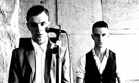
Frame 5 - Artist
I think that this shot is the shot that uses the most obvious convention of indie/electro/synth-pop which is showcasing the artist miming along to the song on there own with a plain/dark background and not much else is going on. We developed this convention by having the shots if the artist in black and white and only the shots containing the artist are in black and white to separate him out from the rest of the video were we tried to make the colour of the video dull and almost vintage looking. We did this to isolate him, therefore making him the central focus of the music video.

Frame 6 - Fight scene
The fight scene is the pivotal moment in our music video when the storyline comes together and we see the two opposites attract and then. literally collide with each other. This went against the conventions of music videos in this genre because they usually tend to be quite vague and not have a obvious storyline. I think our storyline does use the conventions and remains quite vague and ambiguous for three quarters of the video but then it becomes more noticeable when see the two different characters fight.
The fight scene is the pivotal moment in our music video when the storyline comes together and we see the two opposites attract and then. literally collide with each other. This went against the conventions of music videos in this genre because they usually tend to be quite vague and not have a obvious storyline. I think our storyline does use the conventions and remains quite vague and ambiguous for three quarters of the video but then it becomes more noticeable when see the two different characters fight.
Frame 7 - Lighting effects
We used a convention by playing around with the lighting and eventually came to using the strobe lighting to give our music video a scary/eery feel. Even though it was just the shadow of a hand in front of a strobe light it was simple but effective.
We used a convention by playing around with the lighting and eventually came to using the strobe lighting to give our music video a scary/eery feel. Even though it was just the shadow of a hand in front of a strobe light it was simple but effective.
Frame 8 - Instrument (Keyboard)
We used one of the most obvious conventions of a music video which is showing the main instrument in the video from that genre and for us that was a keyboard. We filmed it from a higher angle which was slightly developing the conventions.
We used one of the most obvious conventions of a music video which is showing the main instrument in the video from that genre and for us that was a keyboard. We filmed it from a higher angle which was slightly developing the conventions.
The masks are representative for our storyline but are also part of the costumes and props. Our costumes conformed with other costumes in our genre as when we were researching we saw costumes used predominantly as something the audience should focus on. However we developed it by creating and designing the masks ourselves so they would be unique to our video as they were handmade, and this isn't something you usually see in synth/electro/pop music videos.


